DIANA
THE PORTRAIT PHOTGRAPHER
Challenge
Developing branding and a website for a portrait photographer in Dubai requires capturing the essence of their unique artistic style and personality. The challenge was to create a cohesive visual identity that resonates with her clients seeking professional photography services.
Strategy
Our strategy focused on understanding the photographer's creative vision and target audience. We crafted a branding concept and website design that reflects elegance, professionalism, and creativity while showcasing the photographer's portfolio in a captivating way.
Website Design and Development
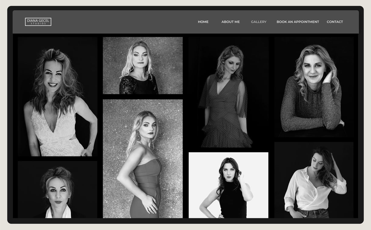
A website that embodies elegance and sophistication, aligning seamlessly with Diana's commitment to capturing timeless moments with grace and precision. We opted for a clean and minimalistic design, featuring a striking black background to enhance visual impact and allow her stunning photography to take center stage.
The website layout is carefully curated, emphasizing intuitive navigation and user-friendly functionality to ensure a seamless browsing experience. Each page is meticulously crafted to showcase Diana's portfolio, with an emphasis on clarity and visual storytelling.


Logo and Identity
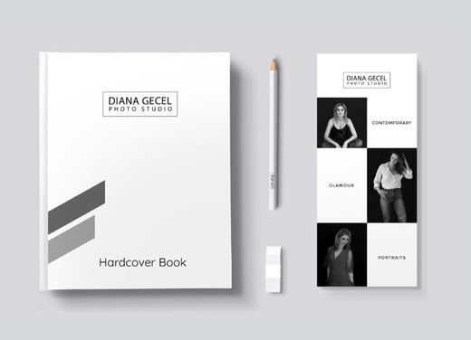
Our approach centered on creating a logo that exudes sophistication and timelessness, reflecting Diana's commitment to capturing moments of enduring beauty and significance. Inspired by the traditional technique photographers use to frame their subjects, we crafted a logo that features Diana's name in bold, uppercase letters, enclosed within a refined rectangular outline. This design element symbolizes Diana’s dedication to her craft and her attention to every detail, much like the way she composes her photographs.
Typography
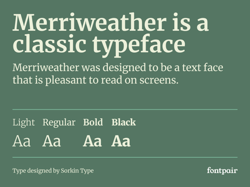
We wanted a font that exuded sophistication and versatility. Merriweather's ability to seamlessly transition between different design contexts allows us to create a cohesive and impactful visual identity for her photography brand. Whether used in branding materials, website headings, or body text, adding a touch of timeless elegance that resonates with her audience.


Color Palette
We carefully selected a color palette that would encapsulate her artistic vision and resonate with her sophisticated clientele. The timeless black, white, and grey palette plays a critical role in conveying her self brand. White reflects the clarity and honesty in Diana’s work while Black and grey embodies the edginess, professionalism, and luxurious quality of her photography. Together, these colors create a modern, simple, yet luxurious visual identity that resonates deeply with her audience and setting her apart in a competitive market.
Visual Identity
The visual identity features a refined aesthetic that seamlessly integrates into stationery with clean lines and a minimalist approach, the branding highlights Diana's dedication to capturing timeless moments with precision and artistry. Each element of the design, from the typography to the layout, reflects the high standards and professionalism that define Diana Photography, ensuring that her brand makes a lasting impression on every medium.
Digital and Print
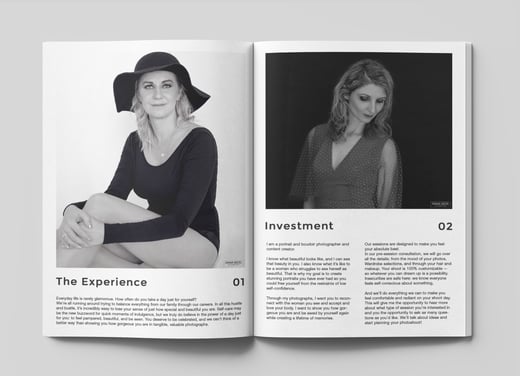
The magazine's layout is meticulously crafted, featuring a blend of striking imagery and elegant typography that captures the essence of her photography. For the print version, we selected high-quality paper and finishes to ensure that each page exudes sophistication and luxury, creating a tactile experience that complements the visual content. The digital version is optimized for an immersive viewing experience, with interactive elements that engage the audience and bring Diana’s stunning portraits to life on screen.
Business Identity
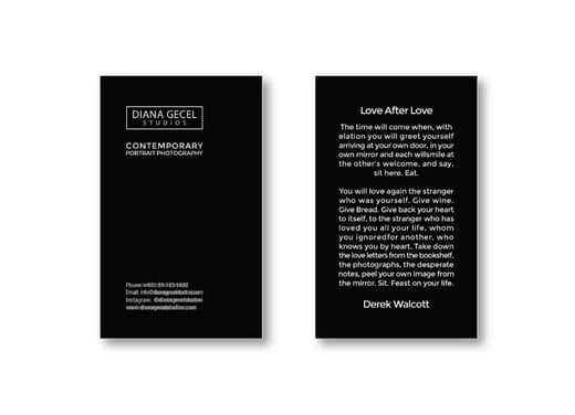
Embracing the theme of portrait photography, we oriented the text in portrait mode. This subtle yet impactful design choice reflects the vertical framing commonly used in her work, creating a direct visual connection between the card and her artistic focus.
The card's layout is clean and elegant, with carefully chosen typography and spacing that convey professionalism and sophistication. High-quality materials and finishes ensure that the business card leaves a lasting impression, mirroring the excellence of Diana's photography.
